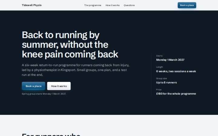
Astro components render to HTML with no client JavaScript. React components are accessible primitives for interactive screens. Both read only the tokens, so everything below follows this site's brand.
Props tables are generated from the packages at build time. Hover and focus are also shown with the pointer away, labelled, so you can see every state at once.
Astro components
Import
import Button from "@brandcloud/astro/components/Button.astro";
Button
Same props as the React Button. A link when it has href, otherwise a button. No arrows inside; a channel glyph is the only icon allowed.
A page section. tone re-points the tokens for everything inside, so components on an ink or brand section take its colours. Use the brand tone once per page at most.
tone="default"
tone="muted"
tone="raised"
tone="ink"
tone="brand"
Section props
Props of Section
Prop
Type
Default
What it does
tone
SectionTone
none
appearance
"neutral" | "brand" | "inverse"
none
space
"none" | "tight" | "default" | "loose"
"default"
width
"narrow" | "default" | "wide" | "full"
"default"
as
"section" | "div" | "aside" | "header" | "footer"
"section"
contained
boolean
true
Set false to render children without the inner Container (full-bleed layouts).
id
string
none
class
string
none
aria-labelledby
string
none
aria-label
string
none
Heading
Rank (as) and look (size) are set separately. These examples use as="p" so they do not add to this page's outline.
size="display"
size="h1"
size="h2"
size="h3"
size="h4"
Heading props
Props of Heading
Prop
Type
Default
What it does
as
"h1" | "h2" | "h3" | "h4" | "p"
"h2"
size
"display" | "h1" | "h2" | "h3" | "h4"
none
id
string
none
class
string
none
balance
boolean
true
Hero
Three layouts so two sites never share one look: split beside a real photo, field on a solid surface with key facts, and editorial.
No backend: it posts natively to your action. The script adds inline errors and moves focus to the first problem. In preview mode it never sends. Consent is unticked and separate.
Ask a mechanic
submits the empty form, so the component's own validation shows its errors.
Also accepts: Omit<FieldsetHTMLAttributes<HTMLFieldSetElement>, "onChange" | "value" | "defaultValue">
Switch
An on and off switch, a checkbox underneath.
Switch props
Props of Switch
Prop
Type
Default
What it does
checked
boolean | undefined
none
defaultChecked
boolean | undefined
false
onChange
InputHTMLAttributes<HTMLInputElement>["onChange"]
none
onCheckedChange
((checked: boolean) => void) | undefined
none
label
ReactNode
none
Also accepts: Omit<InputHTMLAttributes<HTMLInputElement>, "type" | "onChange" | "checked" | "defaultChecked">
React: Overlays
Focus is trapped where it should be, Escape closes, and focus returns to the trigger.
Dialog
Drawer
Menu
Popover
Tooltip
Toast
Dialog
A modal with a title, description, content and actions. The trigger must be one real button.
Dialog props
Props of Dialog
Prop
Type
Default
What it does
trigger required
TriggerElement
none
Exactly one interactive button element. BrandCloud intentionally does not accept arbitrary ReactNode here because Base UI trigger behaviour must be composed onto the actual interactive element.
description
StableReactNode
none
children required
StableReactNode
none
actions
StableReactNode
none
closeLabel
string
"Close"
Text for the built-in close button.
open
boolean
none
Controlled state.
defaultOpen
boolean
none
Initial state for uncontrolled usage.
onOpenChange
(open: boolean) => void
none
portalDirection
Direction
none
Optional portal presentation overrides. When omitted, values are captured from document.documentElement when the dialog opens.
portalTheme
string
none
portalDataAttributes
PortalDataAttributes
none
Data attributes copied to the portaled root for scoped presentation adapters.
className
string
none
Optional class applied to the trigger element.
title required
string | number | bigint | Exclude<AccessibleTitleNode, string | number | bigint>
none
A primitive visible title that supplies its own programmatic name.
titleAccessibleLabel
string | string
none
Drawer
A modal panel from the left or right edge.
Drawer props
Props of Drawer
Prop
Type
Default
What it does
trigger required
DrawerTriggerElement
none
Exactly one real button onto which Base UI composes trigger behaviour.
description
StableReactNode
none
children required
StableReactNode
none
actions
StableReactNode
none
closeLabel
string
"Close"
side
DrawerSide
"right"
open
boolean
none
defaultOpen
boolean
none
onOpenChange
(open: boolean) => void
none
portalDirection
DrawerDirection
none
portalTheme
string
none
portalDataAttributes
PortalDataAttributes
none
Data attributes copied to the portaled root for scoped presentation adapters.
className
string
none
title required
string | number | bigint | Exclude<AccessibleTitleNode, string | number | bigint>
none
A primitive visible title that supplies its own programmatic name.
titleAccessibleLabel
string | string
none
Menu
The root of an actions menu.
Menu props
Props of Menu
Prop
Type
Default
What it does
children required
ReactNode
none
open
boolean | undefined
none
Controlled open state.
defaultOpen
boolean | undefined
false
Initial state for uncontrolled usage.
onOpenChange
((open: boolean) => void) | undefined
none
Event handler called when the menu opens or closes.
side
MenuSide | undefined
"bottom"
Default side of the trigger the popover is placed on.
align
MenuAlign | undefined
"center"
Default alignment of the popover relative to the trigger.
MenuTrigger
The button that opens the menu.
MenuTrigger props
Props of MenuTrigger
Prop
Type
Default
What it does
children
ReactNode
none
Also accepts: Omit<BaseMenuTriggerProps, "children">
MenuPopover
The menu panel.
MenuPopover props
Props of MenuPopover
Prop
Type
Default
What it does
children
ReactNode
none
side
MenuSide | undefined
none
align
MenuAlign | undefined
none
Also accepts: Omit<BaseMenuPopupProps, "children">
MenuItem
One action. onSelect runs on click or Enter.
MenuItem props
Props of MenuItem
Prop
Type
Default
What it does
onSelect
(() => void) | undefined
none
Called when the item is activated by pointer or keyboard.
closeOnSelect
boolean | undefined
true
Whether the menu closes after the item is selected.
Also accepts: Omit<BaseMenuItemProps, "onClick" | "closeOnClick">
MenuCheckboxItem
An item that toggles.
MenuCheckboxItem props
Props of MenuCheckboxItem
Prop
Type
Default
What it does
children
ReactNode
none
Also accepts: Omit<BaseMenuCheckboxItemProps, "children">
MenuGroup
Groups items under a label.
MenuGroup props
Props of MenuGroup
Prop
Type
Default
What it does
children
ReactNode
none
Also accepts: Omit<BaseMenuGroupProps, "children">
MenuLabel
The label of a group.
MenuLabel props
Props of MenuLabel
Prop
Type
Default
What it does
children
ReactNode
none
Also accepts: Omit<BaseMenuGroupLabelProps, "children">
MenuSeparator
A rule between groups.
MenuSeparator props
Also accepts: HTMLAttributes<HTMLDivElement>
Popover
Non-modal content anchored to a trigger.
Popover props
Props of Popover
Prop
Type
Default
What it does
children required
ReactNode
none
open
boolean | undefined
none
Controlled open state.
defaultOpen
boolean | undefined
false
Initial state for uncontrolled usage.
onOpenChange
((open: boolean) => void) | undefined
none
Event handler called when the popover opens or closes.
side
PopoverSide | undefined
"bottom"
Default side of the trigger the content is placed on.
align
PopoverAlign | undefined
"center"
Default alignment of the content relative to the trigger.
PopoverTrigger
The button that opens it.
PopoverTrigger props
Props of PopoverTrigger
Prop
Type
Default
What it does
children
ReactNode
none
Also accepts: Omit<BasePopoverTriggerProps, "children">
PopoverContent
The panel.
PopoverContent props
Props of PopoverContent
Prop
Type
Default
What it does
children
ReactNode
none
side
PopoverSide | undefined
none
align
PopoverAlign | undefined
none
Also accepts: Omit<BasePopoverPopupProps, "children">
Tooltip
A short label on hover and keyboard focus. Never the only place for important text.
Tooltip props
Props of Tooltip
Prop
Type
Default
What it does
children required
ReactNode
none
delay
number | undefined
300
closeDelay
number | undefined
0
open
boolean | undefined
none
defaultOpen
boolean | undefined
false
onOpenChange
((open: boolean) => void) | undefined
none
disabled
boolean | undefined
false
TooltipTrigger
The element the tooltip describes.
TooltipTrigger props
Props of TooltipTrigger
Prop
Type
Default
What it does
children
ReactNode
none
Also accepts: Omit<BaseTooltipTriggerProps, "delay" | "closeDelay" | "children">
TooltipContent
The tooltip text.
TooltipContent props
Props of TooltipContent
Prop
Type
Default
What it does
side
TooltipSide
"top"
align
TooltipAlign
"center"
children
ReactNode
none
Also accepts: Omit<BaseTooltipPopupProps, "children">
Toast
A short status message that closes itself after duration.
Toast props
Props of Toast
Prop
Type
Default
What it does
open required
boolean
none
onOpenChange required
(open: boolean) => void
none
duration
number
6000
tone
NoticeTone
"info"
title
ReactNode
none
dismissLabel
string
"Dismiss"
Also accepts: Omit<HTMLAttributes<HTMLDivElement>, "title" | "role">
React: Structure and identity
Disclosure, tabs and layout pieces with the keyboard behaviour people expect.
Accordion
Most are ready the same day.
Tabs
Three bookings today.
Separator
Above the rule
Below the rule
LeftRight
Card and Badge
Full service
Ready the same day.
Most booked
Safety check
Twenty minutes, while you wait.
Container, Stack, Heading
A stack with a small gap
Stacks space their children evenly.
VisuallyHidden
Avatar and AvatarGroup
RMTHAO
RMTH
Accordion
A set of disclosure sections, one or many open.
Accordion props
Props of Accordion
Prop
Type
Default
What it does
value
AccordionValue[]
none
Open item values (controlled).
defaultValue
AccordionValue[]
none
Initially open item values (uncontrolled).
onValueChange
(value: AccordionValue[]) => void
none
multiple
boolean
false
Allow more than one item open at once. Defaults to false (one at a time).
disabled
boolean
false
Also accepts: Omit<HTMLAttributes<HTMLDivElement>, "defaultValue" | "onChange" | "dir">
AccordionItem
One section.
AccordionItem props
Props of AccordionItem
Prop
Type
Default
What it does
value required
AccordionValue
none
disabled
boolean
none
Also accepts: Omit<HTMLAttributes<HTMLDivElement>, "dir">
AccordionTrigger
Its heading button. headingLevel keeps the outline right.
AccordionTrigger props
Props of AccordionTrigger
Prop
Type
Default
What it does
headingLevel
AccordionHeadingLevel
3
Heading level wrapping the trigger, so the outline stays correct. Defaults to 3.
children required
ReactNode
none
Also accepts: Omit<HTMLAttributes<HTMLButtonElement>, "dir">
AccordionPanel
Its content.
AccordionPanel props
Also accepts: Omit<HTMLAttributes<HTMLDivElement>, "dir">
Tabs
Tabs with automatic or manual activation.
Tabs props
Props of Tabs
Prop
Type
Default
What it does
value
TabsValue
none
defaultValue
TabsValue
none
onValueChange
(value: TabsValue) => void
none
activation
TabsActivation
"automatic"
orientation
TabsOrientation
"horizontal"
Also accepts: HTMLAttributes<HTMLDivElement>
TabsList
The row of tabs. Give it an aria-label.
TabsList props
Also accepts: HTMLAttributes<HTMLDivElement>
TabsTab
One tab.
TabsTab props
Props of TabsTab
Prop
Type
Default
What it does
value required
TabsValue
none
Also accepts: ButtonHTMLAttributes<HTMLButtonElement>
TabsPanel
The panel for a tab value.
TabsPanel props
Props of TabsPanel
Prop
Type
Default
What it does
value required
TabsValue
none
keepMounted
boolean
none
Also accepts: HTMLAttributes<HTMLDivElement>
Separator
A rule, horizontal or vertical, real or decorative.
Separator props
Props of Separator
Prop
Type
Default
What it does
orientation
SeparatorOrientation
"horizontal"
decorative
boolean
false
Purely visual rule: hidden from assistive technology. Defaults to false (a real separator).
Also accepts: Omit<HTMLAttributes<HTMLDivElement>, "dir">
Card
A surface for grouped content. elevated adds a shadow.
Card props
Props of Card
Prop
Type
Default
What it does
elevated
boolean
false
Also accepts: HTMLAttributes<HTMLDivElement>
Badge
A small label. Accepts span attributes.
Container
A centred column. Accepts div attributes.
Stack
Vertical spacing between children.
Stack props
Props of Stack
Prop
Type
Default
What it does
gap
"sm" | "md" | "lg" | "xl"
"md"
align
"start" | "center" | "end" | "stretch"
"stretch"
Also accepts: HTMLAttributes<HTMLDivElement>
Heading
A heading with rank (as) and size set separately.
Heading props
Props of Heading
Prop
Type
Default
What it does
as
"h1" | "h2" | "h3" | "h4"
"h2"
size
"sm" | "md" | "lg" | "xl"
"md"
Also accepts: HTMLAttributes<HTMLHeadingElement>
VisuallyHidden
Text for screen readers only. Accepts span attributes.
Avatar
A photo or initials, with the name as its label.
Avatar props
Props of Avatar
Prop
Type
Default
What it does
name required
string
none
Person or organisation name. Used for the accessible label and the initials fallback.
src
string
none
size
AvatarSize
"md"
decorative
boolean
false
Set when the avatar sits next to the visible name, so it is not announced twice.
Also accepts: Omit<HTMLAttributes<HTMLSpanElement>, "children" | "dir">
AvatarGroup
Overlapping avatars with one label for the group.
AvatarGroup props
Props of AvatarGroup
Prop
Type
Default
What it does
label required
string
none
Accessible label for the group, for example "Workspace members".
Also accepts: HTMLAttributes<HTMLDivElement>
React: Feedback
Status, progress and asking for feedback. Spinners stop spinning under reduced motion.
Notice
Information
Opening hours change on Monday
We open at 9am from next week.
Success
Booking confirmed
Warning
Parts on order
Your wheel arrives Friday.
Error
Payment failed
Try another card.
Meter
Slots booked today
6 of 8
Storage used
92%
Loading
FeedbackPrompt
Was this page useful?
How was your service?
PoorGreat
Notice
An inline message in four tones, optionally dismissible.
Notice props
Props of Notice
Prop
Type
Default
What it does
tone
NoticeTone
none
title required
ReactNode
none
children
ReactNode
none
actions
ReactNode
none
dismissLabel
string
none
headingLevel
1 | 2 | 3 | 4 | 5 | 6
none
dismissible required
true | false
none
onDismiss required
() => void | undefined
none
Also accepts: Omit<HTMLAttributes<HTMLDivElement>, "title" | "role">
Meter
A measured value in a range, with its accessible value text.
Meter props
Props of Meter
Prop
Type
Default
What it does
label required
ReactNode
none
ariaLabel
string
none
Required when the visible label is rich content rather than a string or number.
value required
number
none
min
number
0
max
number
100
ariaValueText required
string
none
Human-readable accessible value, such as “3 of 5 seats used”.
formattedValue
ReactNode
none
Visible value. Defaults to a deterministic percentage.
tone
MeterTone
"neutral"
Also accepts: Omit<HTMLAttributes<HTMLDivElement>, "aria-label" | "aria-labelledby" | "children" | "role">
Spinner
Indeterminate loading with a label.
Spinner props
Props of Spinner
Prop
Type
Default
What it does
label required
string
none
size
SpinnerSize
"md"
Also accepts: HTMLAttributes<HTMLDivElement>
Skeleton
A placeholder shape while content loads.
Skeleton props
Props of Skeleton
Prop
Type
Default
What it does
width
string | number
none
height
string | number
none
borderRadius
string | number
none
shimmer
boolean
false
Also accepts: HTMLAttributes<HTMLDivElement>
Progress
Determinate progress.
Progress props
Props of Progress
Prop
Type
Default
What it does
value
number
none
min
number
0
max
number
100
ariaValueText
string
none
Also accepts: Omit<HTMLAttributes<HTMLDivElement>, "role" | "aria-valuenow" | "aria-valuetext">
FeedbackPrompt
Yes or no, a 1 to 5 rating, or a 0 to 10 score, with an optional comment.
Photos of the bikePNG or JPG. Nothing is uploaded in this demo.
TextButton
A button presented as inline text. From /experimental/text-button.
TextButton props
Props of TextButton
Prop
Type
Default
What it does
emphasis
"accent" | "neutral"
"accent"
Semantic emphasis for the revealed action surface.
Also accepts: ButtonHTMLAttributes<HTMLButtonElement>
StatusPillAction
A status note on a link or button you own. From /experimental/annotated-action. Not drawn here: its pill floats over the action, which the AI-look rules flag (AP-COMP-03), so use it sparingly.
StatusPillAction props
Props of StatusPillAction
Prop
Type
Default
What it does
children required
ReactNode
none
status required
ReactNode
none
statusAriaHidden
boolean
true
Decorative by default. Put equivalent status text in the action's accessible name.
active
boolean
false
Shows a restrained activity marker without changing the accessible label.
emphasis
"accent" | "neutral"
"accent"
Also accepts: HTMLAttributes<HTMLSpanElement>
HandwrittenAction
A short note beside a link or button you own.
HandwrittenAction props
Props of HandwrittenAction
Prop
Type
Default
What it does
children required
ReactNode
none
note required
ReactNode
none
noteAriaHidden
boolean
true
Decorative by default. Set false when the note adds information absent from the action label.
emphasis
"accent" | "neutral"
"accent"
noteStyle
"handwritten" | "plain"
"handwritten"
tone
"light" | "dark"
"light"
Also accepts: HTMLAttributes<HTMLSpanElement>
FloatingField
An input whose label moves above the text. From /experimental/polish.
FloatingField props
Props of FloatingField
Prop
Type
Default
What it does
label required
string
none
hint
string
none
error
string
none
Also accepts: Omit<InputHTMLAttributes<HTMLInputElement>, "placeholder">
ActionList
A removable list of items with optional tags.
ActionList props
Props of ActionList
Prop
Type
Default
What it does
title required
string
none
items required
readonly ActionListItem[]
none
tags
readonly ActionListTag[]
[]
clearLabel
string
"Clear all"
emptyMessage
string
"No recent items."
onClear
() => void
none
onRemoveItem
(id: string) => void
none
onRemoveTag
(id: string) => void
none
Also accepts: HTMLAttributes<HTMLElement>
RangeSlider
A two-handle range with an optional histogram.
RangeSlider props
Props of RangeSlider
Prop
Type
Default
What it does
label required
string
none
min required
number
none
max required
number
none
step
number
1
value required
readonly [number, number]
none
histogram
readonly number[]
[]
formatValue
(value: number) => string
String
onValueChange required
(value: [number, number]) => void
none
Also accepts: Omit<HTMLAttributes<HTMLDivElement>, "onChange">
MilestoneSelector
A single choice drawn as a row of milestones.
MilestoneSelector props
Props of MilestoneSelector
Prop
Type
Default
What it does
legend required
string
none
options required
readonly MilestoneOption[]
none
value
string
none
onValueChange required
(value: string) => void
none
Also accepts: Omit<HTMLAttributes<HTMLFieldSetElement>, "onChange">